It started with a pair of killer orange shades being passed around a tour bus, looking ridiculously good on everyone. The rest, as they say, is eyewear history—born backstage, built for self-expression, with music at its heart and change on its mind. And did we mention they donate proceeds through Calling All Crows to create safer spaces in live music? Because they do; cool shades with an even cooler mission? We were in.
Cheeks
Services
Branding
Packaging
Illustration

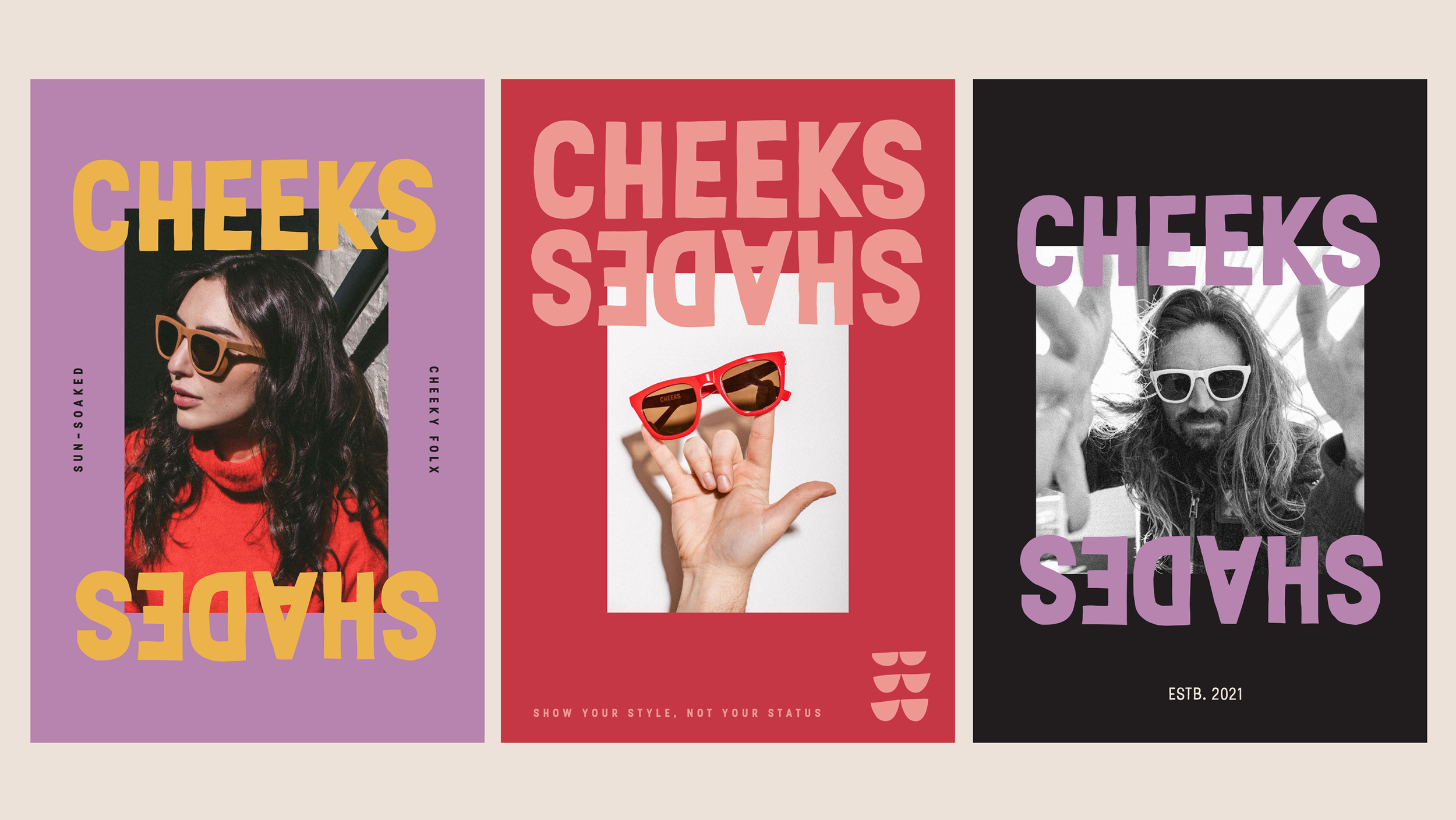
Say hello to Cheeks.
When you're making shades that say "holy shit, these are cool" instead of "check out my designer logo," you need a name to match. We named them Cheeks – because it makes you smile (try not to) and, well, you know where shades live. Then we built a brand identity as refreshing as finding the perfect frames minus the sticker shock.


A design that rocks & rolls.
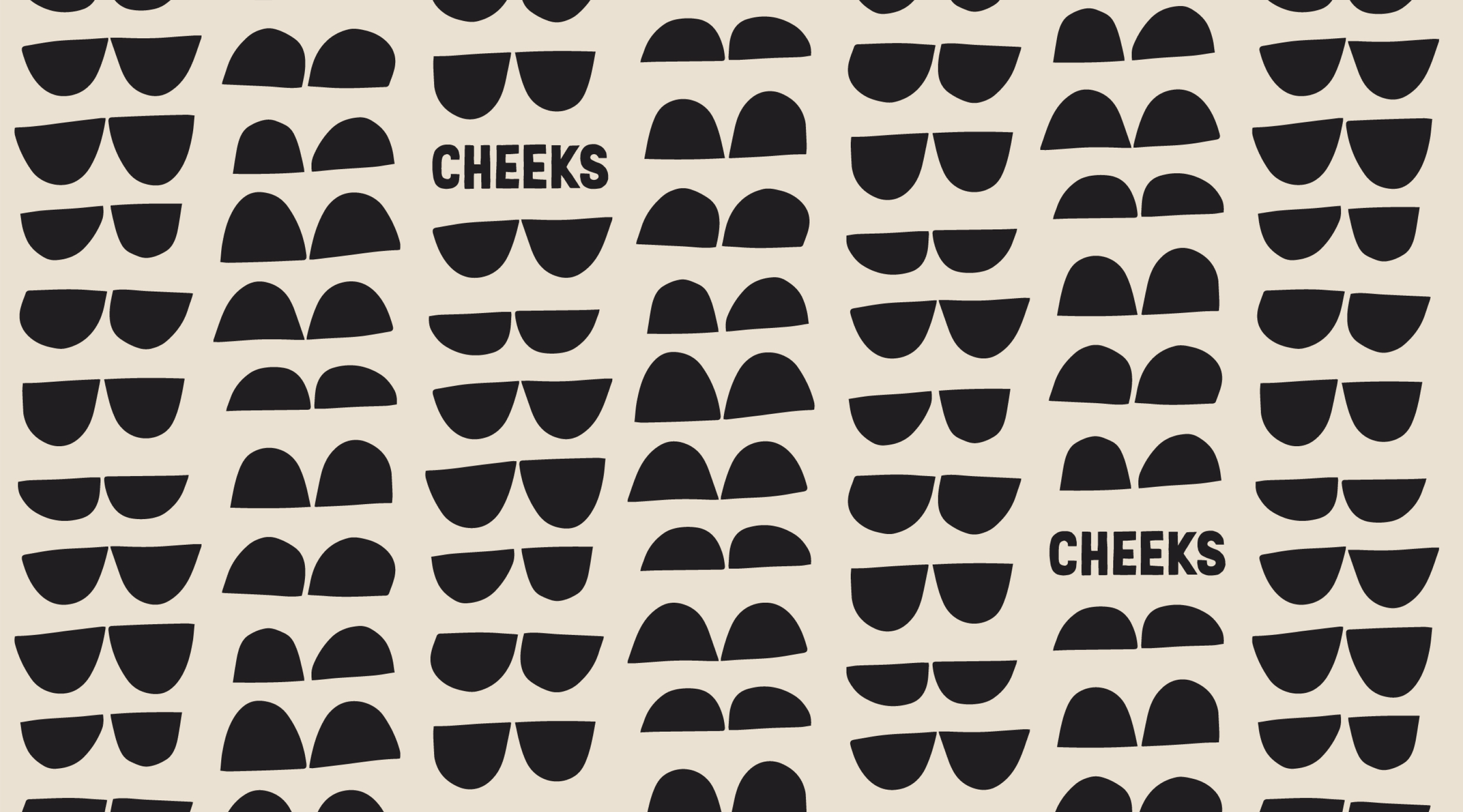
To capture the brand's bold and unabashed spirit, we created a visual language that turned the volume UP. Hand-drawn type and custom illustrations created a sense of individuality, creativity, and zero fear of standing out, while an ever-moving logo and patterns packed with personal touches dialed up the diverse, irreverent energy that Cheeks was born to celebrate. The result? A visual identity with as much swagger as the shades themselves.