With over two centuries under their boots, the Appalachian Mountain Club (AMC) is the oldest outdoor club in America. But after a 2019 rebrand left their identity feeling a little off-trail, they came to us to help bring it back home—just ahead of their 250th anniversary. So, we rolled up our sleeves to revive the spirit, re-earn the trust, and give the brand a look that feels as timeless as the outdoors itself.
Appalachian Mountain Club
Services
Branding
Illustration

Back to the heart of it.
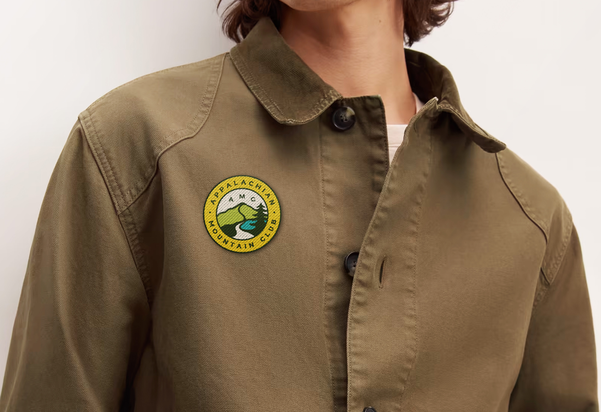
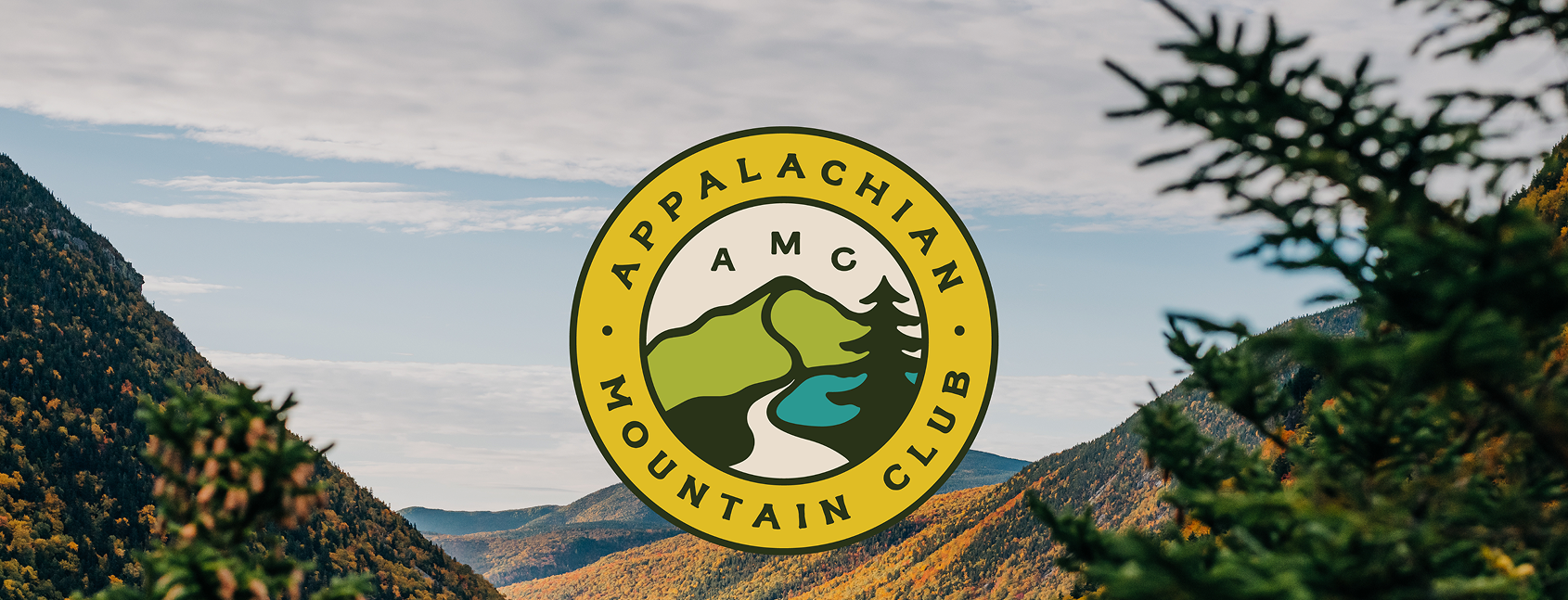
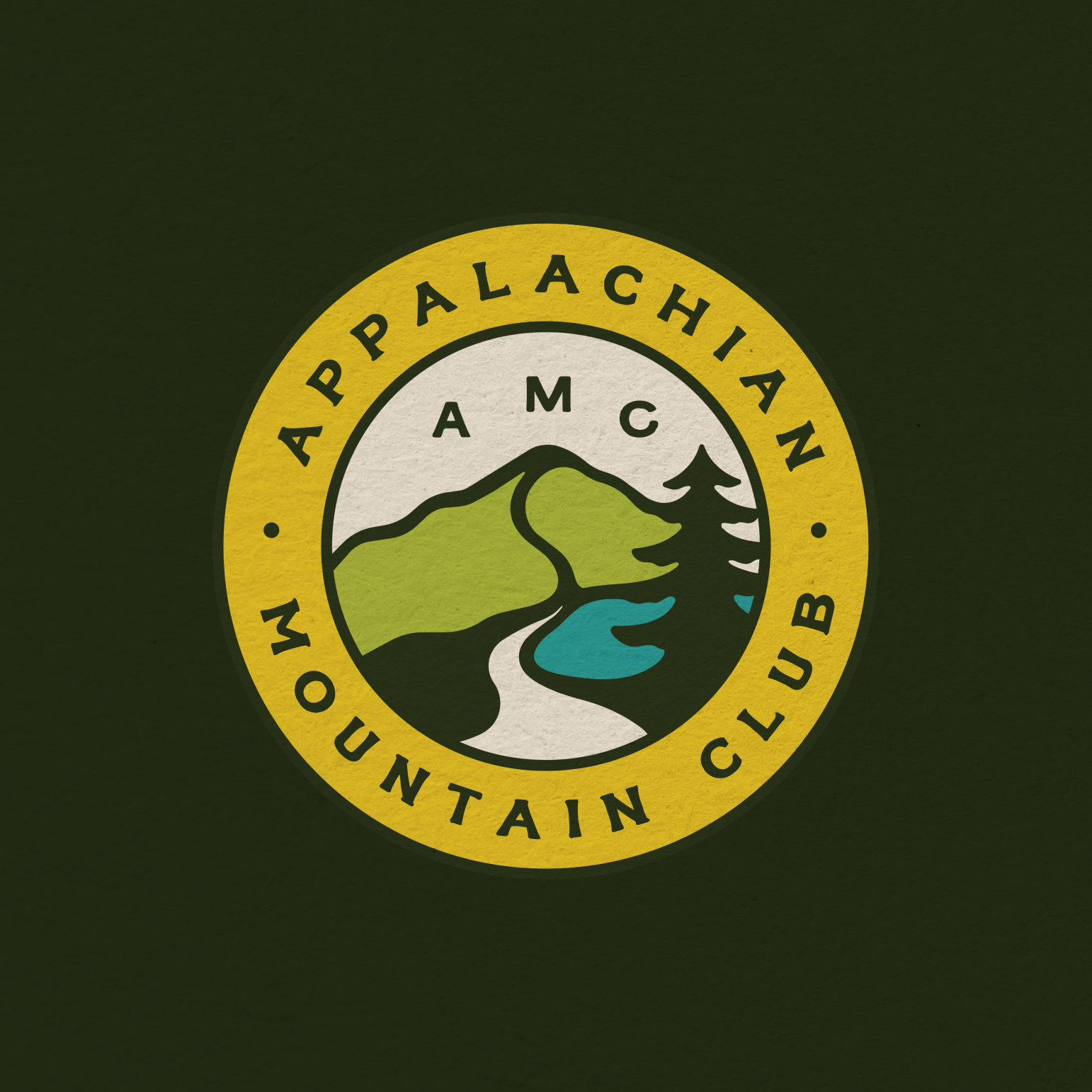
AMC’s legacy logo had heart, but it had lost some of its humanity. Our job was to bring that back–modernizing the mark while restoring the spirit people had connected with for centuries. We refined the original elements (river, trail, mountain, tree) into a cleaner, more cohesive system that feels true to the past, ready for the future, and unmistakably AMC.
Surrounding it all: a color palette pulled from the world just beyond your boots. Forest, grass, water, sunshine, and sand lead the way—bold enough to be seen, grounded enough to belong—while secondary tones bloom from the flora and fauna that make any journey outdoors simply unforgettable.

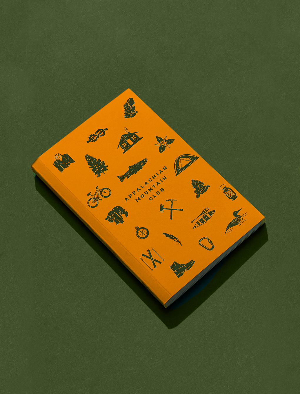
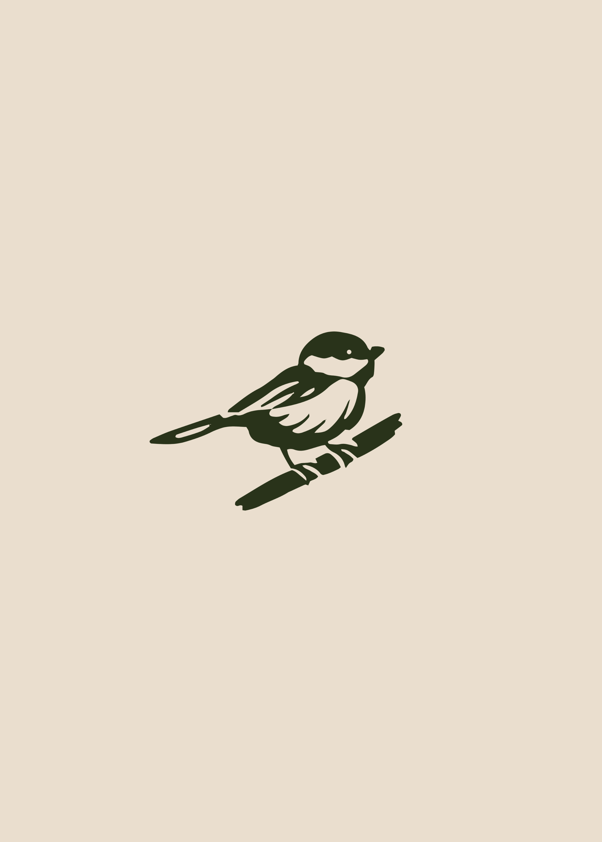
Wildly distinctive.
To add depth and character, we built a suite of illustrations and badge systems that let the brand flex across its chapters and channels. From field-guide inspired icons to patch-worthy trail badges, each graphic was designed to belong out in the wild (and look great on a water bottle, too).
Gear worth going outside for.
Designing new merch wasn’t about slapping a logo on a tee. It was about designing bold, functional merch people actually want to wear and share–from trailhead to town and back again. With just the right amount of graphic punch to earn a spot on your bumper or backpack.