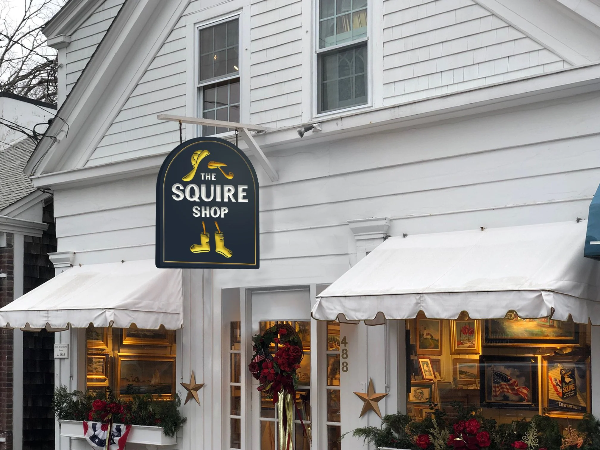
Squire
“New ownership.” For a Cape institution with a logo from the ‘60s it might as well mean sayonara suckers. Our challenge: give their iconic seagull a fresh new do while maintaining its legacy so the locals didn’t murder us.
Services
Identity
Design
New boots, who this?
At the heart of The Chatham Squire is their beloved seagull – weathered and quirky, like the establishment itself. We transformed it into a cleaner mark that still maintained its character so even the regulars would appreciate the new look.


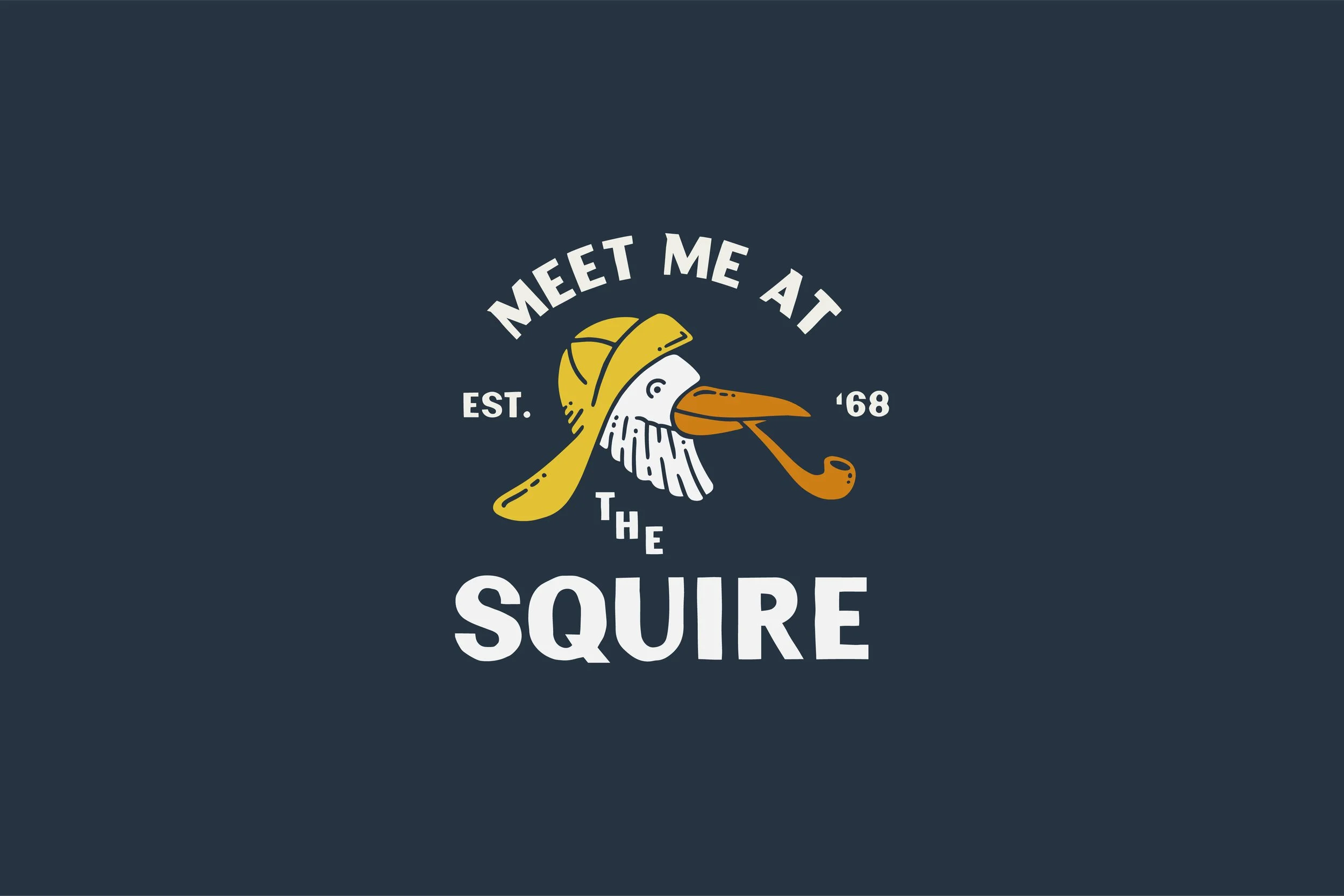
Now make it merch-able.
A new type treatment and graphic lockup let it take on a whole new life outside of the bar. 10/10 people agree: a seagull on your shirt beats a seagull in your fries.