
What's more natural than grass? A picnic on it. That's the kind of simple-but-brilliant thinking we live for. So when a group of friends from the Pioneer Valley came to us with big, blue-sky ideas about leading a greener revolution in cannabis, we spread out the blanket and got to work. The result? A brand that makes you feel good about feeling good.
Picnic
Services
Branding
Naming
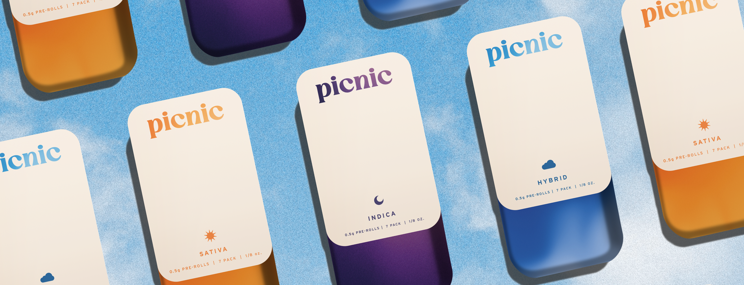
Packaging
Illustration
Nature called. We answered.
We built an identity as intentional as their growing process, starting with a custom typeface that blends modern nostalgia with gentle whimsy. The logo’s playful, modular structure set the foundation—one we extended through a system of surreal, nature-inspired illustrations that echo its shapes and spirit. Together, they form a visual language that feels inviting, thoughtful, and artfully charming.


Designed to spark something.
To expand the visual language, we developed a suite of illustrations that reflect the many moods of a Picnic high—watching clouds drift, having deep thoughts about moss, realizing you’ve been barefoot all day, or doing nothing at all. Each one is tied to the emotional effect of a specific product, giving the brand a way to express variety without losing cohesion or charm.


Sky’s the limit.
To land the palette, we simply looked up. Drawing from the sky’s shifting hues—sunrise to sunset, bluebird days to golden hours—we built a color system that mirrors how Picnic fits into every part of your day. It’s more than a palette. It’s an atmosphere you can step into.


